

Rhythmia
Breath
Holistic prevention & rehab clinic for heart patients
Rhythmia Breath is a prevention and rehabilitation holistic heart health clinic that is designed to bridge the gap between modern medicine and holistic practices.
They’re taking a new approach to medical care by combining the safety of modern medicine and the comfort of holistic practices delivered by in-house clinical nurse specialists.
Scope of work
Lean brand design
Website strategy
Website design
Website development

The challenge
When the co-founders of Rhythmia Breath approached me, they felt disconnected with their brand and website. Despite their unique methods and approach to healing, they blended into a sea of sameness in the medical industry making it hard for them to stand out. Their brand felt too cold and clinical and lacked the holistic aspect which their method and business was based upon.
They discovered their website visitors were leaving more overwhelmed and confused than when they had arrived on their website. This meant that fewer people understood that they could heal with a non-invasive and more holistic approach and so fewer people were booking in for their services. Rhythmia Breath needed a website that would communicate their natural and holistic approach to healing and its impact as well as guide their audience to booking in for their services.

Visual brand identity
Brand Strategy
After researching market peers and brands within the industry, there was a clear visual trend. Most medical brands used a clinical white, blue and/or purple colour with bold sans-serif fonts in their visual brand identity. Given Rhythmia Breath took a more holistic and natural approach to healing in relation to others in the heart care industry, they needed a brand that stood out and conveyed their unique approach and methods to healing.

Brand Identity
The primary goal of the visual rebrand was to infuse calm, healing and approachable aspects to the identity, whilst maintaining a professional and trustworthy stance. As a result, I chose to move away from their cool bright blue and clinical white colour palette and curated a palette that was warmer and more reflective of the brand.
This consisted of beige and brown tones with a deep green accent to promote a calmer presence. The font suite anchored in professionalism and trustworthiness. Not only was this more representative of Rhythmia Breath’s holistic approach, but also meant they stood out amongst their market peers. The way the characters link within the primary logo represent the undulating and oscillating nature of breath. This was key as breath work is a staple practice within clinic.

Website
Website Strategy
Before working with Nabana Studio, the Rhythmia Breath website had information scattered across many pages which made it difficult and more time consuming for website visitors to find what they were looking for and as a result, not booking in with the clinic. The structure of the website was paramount to helping website visitors find what they were looking for and encouraging them to book in for a consultation.
Rhythmia Breath served 3 different client personas. They worked with rehabilitation patients, prevention patients and business owners who wanted to improve the health and well being of their employees. I outlined and mapped out key journeys for each persona to ensure they could find the information they were looking for effortlessly, and take action in booking in for a consultation.

Website Design and Development
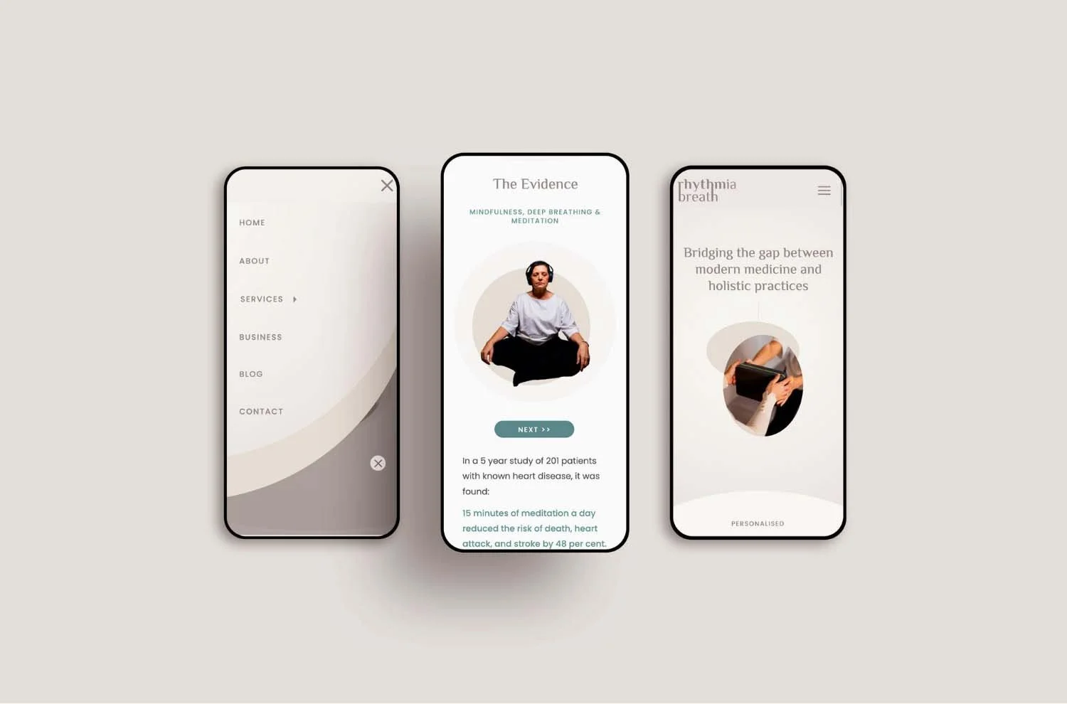
The website experience had to feel as calm, supportive and professional as it did visiting the Rhythmia Breath clinic, whilst keeping website visitors engaged in the content. I used simple and minimalistic layouts to make content easy to digest and read.
The Rhythmia Breath team wanted to educate their audience on how holistic therapies such as breath work, could help heart health, so I highlighted statistics and educational content in large font sizes and shapes, making it hard to miss and attractive to read. Many of Rhythmia Breath’s market peers used straight, clean edges across their websites. I chose to use curved edges, oval/circle shapes and images to create a more memorable and softer website experience.

“Working with Gurpreet increased the number of customers reaching out to us!”
“I was blown away by the level of guidance, support and expert advice we received along the way. Gurpreet really helped us to understand the user journey and what the purpose of our website was before designing the site to reflect this. It was a full end to end experience with her and she guided us along the way so we felt supported throughout.
I didn’t realise the impact of every small detail and the effect it has on our customers. We have had many compliments for the new design and people find it much easier to navigate. This increased the number of customers reaching out to us!
Gurpreet is great at what she does! She is very professional, patient, attentive, supportive and extremely helpful throughout the entire process! She knows what she is talking about and the workshops before designing or developing the site really help you understand your own business better!”
—Amrit Kaur, Co-founder of rhythmia breath


